Thursday
12 March
MIRADOR: Neoclassical grandeur meets contemporary living
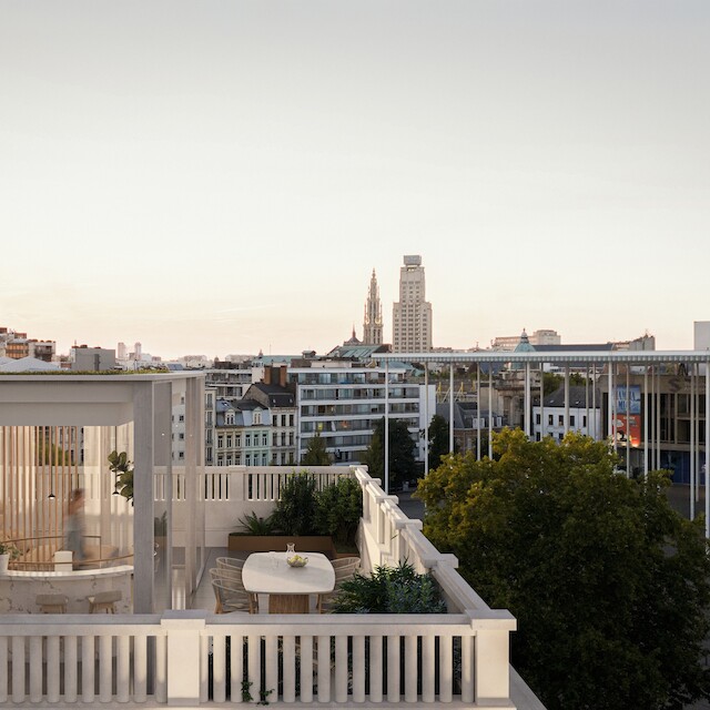
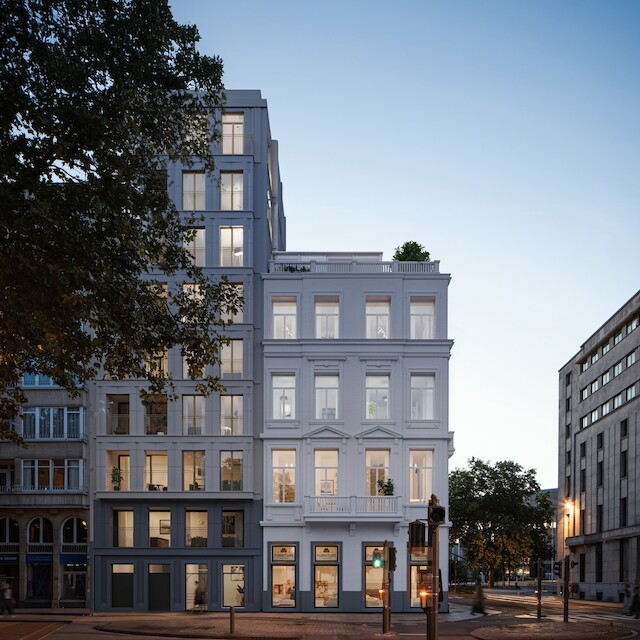
Throughout the Mirador architectural ensemble in central Antwerp, VIVA balances heritage preservation, contemporary design, and sustainability. The façades, 19 apartments and green heart form a coherent residential environment that enjoys daylight, comfort and calm.
Photos: @animotions3d
#adaptiveReuse #architectureTransformation #heritageIntegration #urbanOasis #cityLiving #urbanDesign #transformationProject #facadeDesign #cityHomes #architecture #Mirador #FrankrijkleiAntwerp #cityGarden #spatialDesign #renovationProject #VIVAarchitecture #Antwerp #Belgium
Tuesday
10 March
MIRADOR: Neoclassical grandeur meets contemporary living
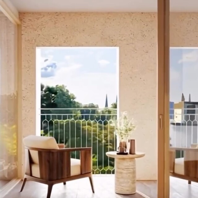
The interiors of the Mirador project reflect the same attention to daylight, space and material quality as the architecture itself. Open layouts, natural light, and high-quality finishes create a comfortable and spacious living experience.
Photos: @animotions3d
#adaptiveReuse #architectureTransformation #heritageIntegration #urbanOasis #cityLiving #urbanDesign #transformationProject #facadeDesign #cityHomes #architecture #Mirador #FrankrijkleiAntwerp #cityGarden #spatialDesign #renovationProject #VIVAarchitecture #Antwerp #Belgium
Monday
9 March
MIRADOR: Neoclassical grandeur meets contemporary living
At a prominent location along Antwerp’s grand avenue Frankrijklei, between the City Park and the vibrant Theaterplein, VIVA designs a new architectural ensemble. By merging four plots, a unique opportunity emerges to connect past and present in a contemporary residential project where light, space, and greenery take center stage.
Photos: @animotions3d
#adaptiveReuse #architectureTransformation #heritageIntegration #urbanOasis #cityLiving #urbanDesign #transformationProject #facadeDesign #cityHomes #architecture #Mirador #FrankrijkleiAntwerp #cityGarden #spatialDesign #renovationProject #VIVAarchitecture #Antwerp #Belgium
Wednesday
4 March
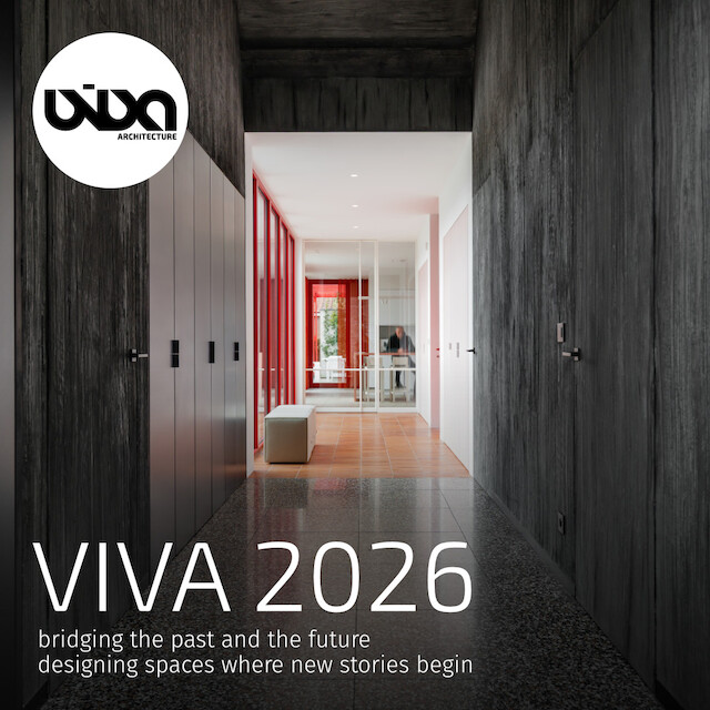
VIVA Architecture is op zoek naar projectarchitect met ervaring.
Heb je minstens 6 jaar ervaring en wil je bij VIVA Architecture als projectarchitect meewerken aan binnenstedelijke herbestemmingsprojecten in CLT?
Profiel:
Je bent gedreven, zelfstandig en je bent een teamplayer.
Je kan een klein team aansturen en bent communicatief zowel intern als extern.
Je kan zelfstandig een lastenboek en meetstaat opmaken.
Je kan zelfstandig de controle van de uitvoering op je nemen en hebt inzicht in bouwmethodieken, bij voorkeur ook CLT.
Je kan goed tekenen met Autocad en Revit en een goede kennis van Photoshop en Indesign.
Je hebt affiniteit met doordachte detaillering.
Het is een plus als je tweetalig bent en projecten in het Frans kan uitvoeren!
Je houdt van goede koffie, lekker eten en genieten, dan ben je bij VIVA Architecture op de juiste plek!
Stuur je CV en portfolio in pdf-formaat naar:
jobs@viva-architecture.com
Thursday
29 January
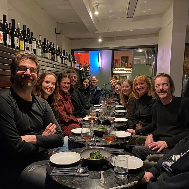
VIVA EATS: Last week we welcomed the New Year with a special dinner✨
Good food, great moments
@bistroestelleantwerp
Friday
16 January
We wish you a colorful year!
Best wishes from the VIVA team -
Sylvie, Maarten, Eline, Ben, Emma, Mieke, Andre, An, Monica, Laura, Jorim, Xinhui
Project: Dialogue between opposites
Photo: @lucid.lucid
Friday
19 December
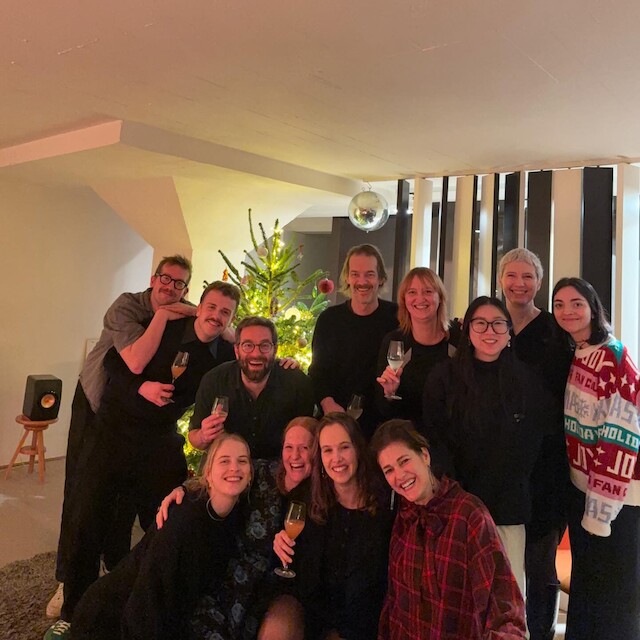
VIVA EATS:
We kicked off the construction holidays yesterday with great food, good company, lots of laughter and handmade gifts! 😍🎁🎅🏻
We’ll see you again on January 5.
Wishing you beautiful holidays, spent in good company. ❤️
Lots of love,
VIVA team ✨
Thursday
11 December
PAVIOTTO: MATERIAL MEETS CHARACTER
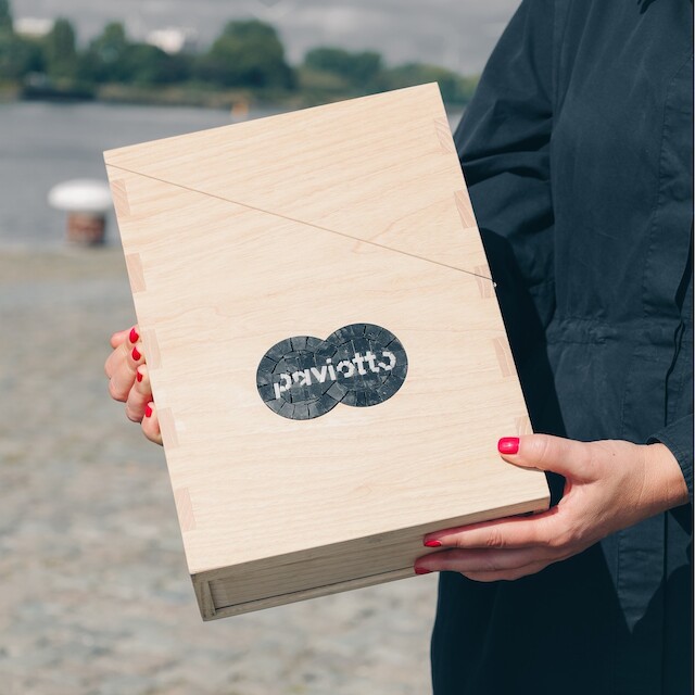
A Box of Creative Possibilities
Terrazzo, cement-based poured floors, and parquet were developed as a coherent system defined by non-directionality and subtle rhythm. Terrazzo incorporates recycled glass discs within a cement matrix with marble granules, creating a balanced and tactile surface in shades of green. Wooden floors were realised in block parquet with varying sizes, enhancing a woven effect, while long-grain sawn wood in warm oiled tones ensures durability and texture. Cement-based poured floors connect seamlessly with terrazzo and wood through smooth transitions. The combination of these three types of flooring offers a variety of creative possibilities, allowing interior designers to interpret and apply them freely through layered surfaces, suggested pathways, and spatial rhythm.
Collab: @paviotto_
#interiordesign #interiorarchitecture #materialdesign #flooringdesign #terrazzo #parquetflooring #pouredfloor #sustainabledesign #architectureproject #creativefloors #interiorinspiration #designcollaboration #experimentaldesign #spatialdesign #floorpatterns #layeredsurfaces #architecturaldetails #architecture #Paviotto #VIVAarchitecture
Tuesday
9 December
PAVIOTTO: MATERIAL MEETS CHARACTER
Where design and technique come together
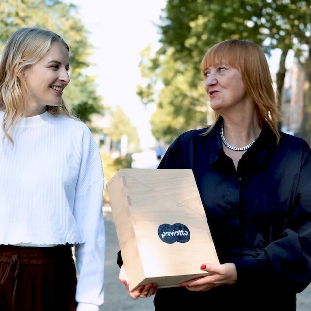
Paviotto is a Dutch specialist in sustainable flooring concepts. Under the label P8 Naturals, eight architects were invited to develop a unique ‘box’ combining terrazzo, parquet, and cement-based poured floors in innovative ways. VIVA participated in the project, stepping out from behind the drawing board and into the laboratory, enabling collaboration between makers and designers through valuable cross-pollination and knowledge-sharing. The three flooring types were designed to blend harmoniously within a single space, creating original aesthetic appeal. Non-directionality guides the design, offering freedom, playful colour, and a timeless quality intended to remain attractive over time.
Collab: @paviotto_
#interiorarchitecture #materialdesign #flooringdesign #terrazzo #parquetflooring #pouredfloor #sustainablematerials #architectureproject #creativefloors #interiordesigninspiration #architecturalcollaboration #designinnovation #colourfulinteriors #experimentaldesign #spatialdesign #architecturelovers #interiordetails #architecture #Paviotto #VIVAarchitecture
